For this
project, we were to create a piece using the influences and the styles of
another artist; an interpretation of their work.
Many
times for projects similar to this one, I would choose an artist that had a
style which was not related in the game industry whatsoever. This time I wanted
to choose someone who was renowned within the industry as it was also something
different this time around for me.
Here are
some of my favourite artists within the game industry that I looked into:
Yoshitaka
Amano
Ayami
Kojima
Yoji
Shinkawa
Yoshitaka
Amano is best known for his work on the early Final Fantasy series. What I like
about his style is how stylised it looks and gives off a mystical and fantasy
like feeling to me.

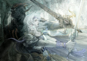

Ayami
Kojima’s style has a gothic look to it that really appeals to me. In some of
her pieces you can see a lot of ‘brushstroke textures’ on the images which I
really like.


Yoji
Shinkawa has a very inky look to his art. I love the way it feels very chaotic,
yet very fluid as well. Another thing I really like is how a lot of his art
blends in with canvas.


I decided
to make a self-portrait in Ayami Kojima’s style and found a picture of myself
where I was wearing quite appropriate clothes which were in my opinion similar
to her character’s art. I created a mood board in order to get a general feel
and mood of her paintings as I paint my own. I wanted to try and get some brush
markings onto the painting on digital to practice some mark making techniques.


