Monday, 3 December 2012

Elements of Game Design, Part 7: level design


I’ve designed a few levels… in games such as Timesplitters and Super Smash Bros Brawl and to say the least the results have always been pretty comical… for five minutes…

Every time I design a stage in these sorts of games the results have always been fun for a little while before becoming absolutely sick of them and wanting to play the default stages chosen. I naturally end up making symmetrical type stages because for some reason my brain wants me to create a certain pattern within the stages I design.

My infamous ‘Sam Bored’ custom stage in Super Smash Bros Brawl is a clear example of bad level design! It’s funny for the first 5 minutes, and then all these problems occur such as ‘not being able to die easily’ and ‘people hiding at the top of the stage on springs!’ Though it’s not very much to play with and we’re limited, I never put any thought onto what would make the level fun to play other than ‘put everything in symmetrically!’ So I guess I’m’ saying it’s not that simple to create a good stage without thinking it through.

Nowadays thinking back to those times I think to myself “why were they so boring to play so quickly? Looking at the game stages that the game developers created, there are many of them that aren’t very symmetrical unlike my designs. When I think about it, it’s been the stages that don’t have a symmetrical design that intrigues me the most and keeps my interest peaked. For example in Super Smash Bros Melee, one of my favourite stages would be the Hyrule Temple stage


Because of the way it’s designed, I find its essentially roughly 3 different areas to battle on. Whereas I can understand the need for balanced stages for the use of tournaments and what not, I’ll be talking about level designs for campaign driven gameplay rather than multiplayer focused stages.

With story driven campaign level designs, you want to keep it challenging, engaging and different. The levels are pretty much your virtual assault course; I’d personally find it dull if the assult course I had to run was just a straight line of nets to trample through. I would want to hop on wooden logs, scale walls, climb monkey bars and swing on ropes! All of these keep me interested and engaged within the course itself.


Of course if it’s like a challenged mode or something that isn’t considered the main story point of the game then I wouldn’t really mind because it’s a side mode but I wouldn’t personally play it for very long if it was that mundane.

Back in the times when the next stages of games were just a difficulty boost, games usually only really needed one programmer and the profession for a dedicated level designer wasn’t particularly required. Generally the player needs to be kept engaged and immersed within the game world as well as in some way directed towards the goal. Just like visual composition certain elements can be used to dictate the player mood and feelings, perhaps even have the player’s actions affect the areas around them. 

In a game called Left 4 Dead 2, I particularly found it interesting on a stage called ‘Hard Rain’ where you would run through the first half of the stage as you would in the other stages. However the gameplay started to change half way through.
The first being that you have to traverse back the way you entered from. Now you may think that’s a bit lazy, but the whole feel of the stage has changed completely.
Firstly the whole area has darkened and the mood changes completely and definitely look more sinister than the previous warm sunset feel.
Secondly it’s heavily raining and the sounds effects further build upon the atmosphere as well as thunder storms that create waves upon waves of zombies running directly at you. The once ‘peaceful stroll’ through the stage has become filled with hazards that impede your journey back such as floods.


Many of Left 4 Dead’s level designs are very good examples (in my opinion) of great level designs. The backdrop of the story definitely leads to many elements they can naturally include within the game and level designs.

I find that depending on the game types and genres, there are different elements to how a level or stage should be designed. Such as a competitive fighting game may end up shifting towards a more balanced stage for competitive one on one games where as games like Super Smash Bros is designed to be a party 4 player battle royal so the level designs will naturally be more quirky and interesting.
Levels that involve the gamer interacting with the stage like Gears of War cover system have always added that depth and realism to the game.
Mortal Kombat is another game that cleverly involves the stages for their fatalities. Players have always had fun with being able to interact with the stages like that and add that depth towards the gameplay rather than just solely being a backdrop arena.


An upcoming game called ‘Injustice: Gods Among us” is a 1 on 1 fighting game that actually involves using parts of the background to their advantage. This trailer shows off a few of those elements adding another depth to the gameplay.
For 1 on 1 competative fighters, it's rather unusual to be able to utilise parts of the stage mid battle so it will be interesting to see how it works out.


I guess where I’m getting at is that levels that look great and suit the game genre, subtlety guides the player towards the main goal and has interactivity in some form or another are the most interesting ones for me.

A gamer like myself however loves to run away from the actual objective to explore and see what I can find, ignoring the hints of the direction I ‘should’ be going. Halo 2 and 3 was a particular game that I remember breaking many maps in and the developers have left Easter eggs and secrets intentionally in broken parts of maps. I guess not every player wants to play by the rules and have joy in breaking them, something which I'm sure the level designers are aware of!

Sunday, 2 December 2012

Tripod Designs


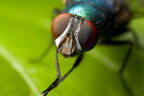
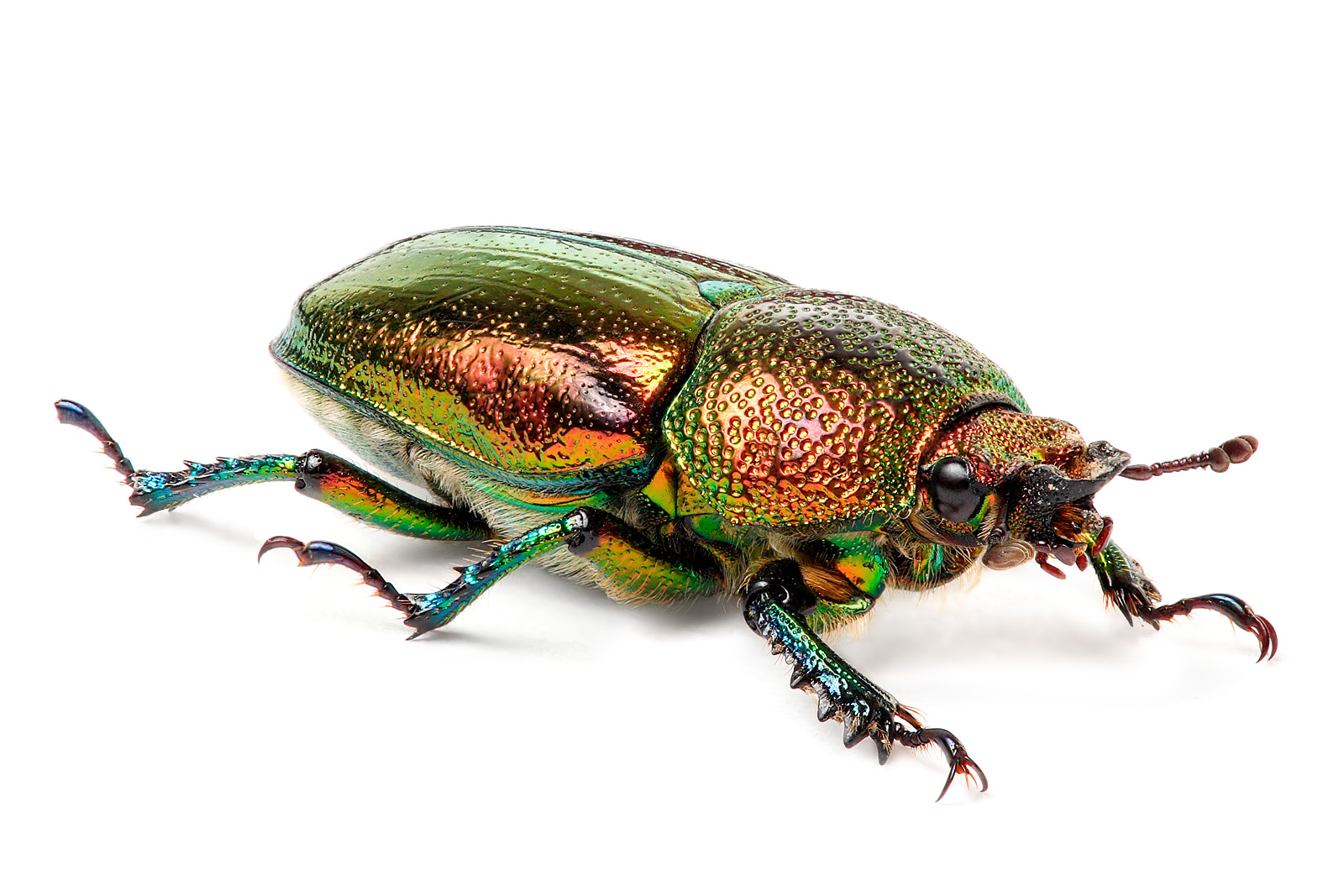
For my starting point, I went to the library with the intentions of finding a books and references about insects and sea life. The reasons I chose those as to start myself off is because I always find sea creatures and insects very eerier and skin crawly as well as being down right bizarre!


With my first few designs I wanted a rather bug mechanical look to it with some hairs protruding from it because I personally find the hairs of insects to be very brrrrr! Sends my body into a shiver! After a few thumbs on these, I decided that it just really wasn’t working. I really didn’t like how immobile it seems and it didn’t look very out of this world.

I decided to maybe make it look more balanced, so I started designing with a more balanced look for the top. I wanted to not overkill the design with details too so I tried to keep it to a minimum on certain places. At this point, I tried to keep it a little similar to the war of the worlds description as well as trying to add in the elements of sea creatures of insects.

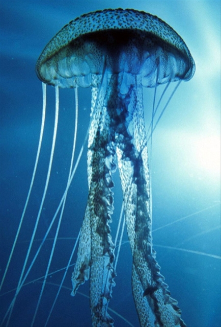
I was a little inspired by the jelly fish to add a wavy cloak layer with the idea of concealing everything underneath the tripod, so that the tentacles can reach out from underneath, snatching out the victims and taking them into the unknown. I played around with this idea but it really wasn’t getting me anywhere so I passed on that plan altogether.

I kept the sort of shape I wanted to the jellyfish look for the head and wanted to add the flies eyes pilot den on the top where the alien pilot resides and takes control. I designed my final tripod design with the idea of the tripod actually being a living mount.
The robotic parts, face mask and the reins on its front legs is to show that it’s being controlled by a master and isn’t in full control of its actions. The third leg (which is actually its tail) was to show the alien creature’s organic side and to not have it completely machine like.

For the final I went into greyscale with a tint of colour to add to the mood. As I haven’t really made a scene of some kind before I wanted to experiment with what I could do with the painting. I wanted to have the tripod climbing onto the top of sky scrapers to show how big it is, placing the horizon line below the middle of the page.
I faded the background to and added another tripod about to attack a helicopter, leaving it in suspense for the viewers to imagine themselves (as well as something for them to find if they look closer). I added in quite a bit of smoke to show a bit of chaos happening in the within the universe of the image.

I put in the fighter jets to show scale of the tripods as well as having a slight foreground element to show distance and space. I didn’t want to take the focus away from the tripod so I made the jet a little grey rather than the darker shade to show it’s on the foreground.
The skyscrapers were to have a kind of line to guide the viewer’s eye to the tripods.


 I was thinking of adding more detail onto the skyscraper’s roofs such as antennae and satellite dishes but I didn’t want too much getting in the way of the tripods legs.
At the end experimented with adding some red lights to the eyes of the tripods. This was mainly because I wanted a slight glimmer from the background tripods eyes to make it seem more menacing. I couldn’t exactly get the right look to it as the one glimmer I wanted was one of which you would get from the sun (the circle glimmer you get from the sun shining onto your camera lens for example).

It turned out to be a really fun experimental piece and I didn’t think I did too bad for my first time really thinking about a scene like this. I think I’ll definitely have to add more detail in certain parts (didn’t want to overkill the image and taking the focus away from the main subject of the final) and I think I’ll try it with full on colour at some point!

Experimental Thumbs Gone Wrong


As an artist, I’ve only really used pencil and charcoal never really done much with colour with other mediums apart from acrylic paints and the occasional pastels (which I really don’t enjoy using). I decided that this would be a great project to push it further. For this project I had got a hold of aqua tone colouring water pencils, Pastels, a brush pen, magic markers and a fine liner pen.

I started off drawing in pencil to begin with and tried to get a quick and sketchy look. My work speed is a problem as I tend to work very slow and so with this project; I had tried to really push my work speed more than usual, disregarding the quality to see how things went.
Things went okay to start with… and then came the unfamiliar mediums…
My thumbs started becoming a mess and I was not happy with them at all. I carried on trying not to be phased by it but things never got any easier. I one of the reasons was that I was rushing my work flow purposely to try and achieve creating something under a faster time in the hopes of improving over time. I also negated the use of an eraser and tried to work with my mistakes. Another thing was that I never really gave myself much time with each medium to get familiar with it.

I really didn’t like using charcoal on such a small scale. I’m so used to drawing large life drawing and still life pieces with it that it just felt so strange working on a little thumbnail with it. It’s definitely something I’ll have to improve with.

The Brush pen went terrible as well. I really like the flow of the pen as it just feels really nice to use. However I couldn’t really think of an effective way to get any quick, gestural drawings flowing. I would love to improve myself with this medium though as I really like the feel of how the pen works!

The magic marker wasn’t that bad really. I enjoyed them more than most other mediums I had tried out. I really enjoyed working over them with the fine liner pen. To me it achieved the sort of quick sketchy look that I was going after when I worked with them.
 
The pastels didn’t go very well, which was no surprise to me. I remember enjoying them a little more when I used them on sugar paper or some kind of paper with more teeth on them so I may try some on a different surface material. However I still usually use them on a larger scale rather than thumbnail sizes so I’ll have to practice and adjust.

The aqua tones water blending colours were pretty fun to use! I liked the flowyness of them when used with the water. Even though it didn’t achieve what I was after with this project, this medium is definitely something I will love to keep practicing in. The paper started to fall apart though when I started working too much into it so I have to be more careful!

Finally the Fine Liner Pen is a medium that I had stayed away from for a long time. I was never very good at creating lines that I could commit too and so I flowed naturally to the pencil. I needed to face it though and decided to go through doing mixed media working pen with the other mediums I experimented with. I definitely have to get those lines of confidences out so I think I’ll use pen much more often (I’m sorry pencil!). One thing I won’t be missing however is how quickly my pencils blunt.

Digital Bradgate Park


For my Bradgate park project, I decided to go all digital for it. The reasons I decided this was because I wanted to improve hand eye coordination with the tablet, experiment a little more with Photoshop tools and techniques… and because Bradgate had terrible weather on the days we went! (Soaked)

With my thumbs I started off trying to get on with colour. It went alright but I ultimately decided that I wanted to improve my greyscale paintings as it’s relatively weak. I started off with the usual point perspectives but gradually moved onto adding subjects that made the paintings a little more interesting.

I went darker with my tones and experimented with a few things on Photoshop. Something I particularly liked was taking a soft brush and using it to add a light source in the distance. With the darker tones and the light source fuzzing the edges of the dark and the addition of adding people or a dog made it much more interesting to look at than the usual point perspectives. 

I had a problem that I wasn’t sure which computer screen I had was more accurate with the “truer” contrast and resolution so I was a little confused as which monitor to go with when enhancing the image to flesh out the contrast. It’s a problem that I will need to look into at some point very soon as I don’t want it to keep impeding with my work flow.
Anyways I ended up upping the contrast to suit the dimmer computer screen as it really killed the mood of how I wanted to portray my paintings.

For my final, I jumped right into colour. I didn’t want to keep drawing Bradgate as some depressing overcast park so I wanted to make it look a little happier. I painted the final with greener, brighter colours and a bright sky. I wanted to give a sort of blur in the background to not focus on the background and more into the river and foreground. However I think that I should actually add a bit more as it’s looking a little lacking….


I experimented with other types of default brushes in this piece. I didn’t think that it was going to make much of a difference but after trying some out, I for some reason had a better times with the trees. With the water, I took one of the dotted default brushes and tapped white onto the river as a finishing touch after colouring it in. I really like that glittery effect and in my opinion really adds to the life of my painting and helps achieve what I was going for. I heard some good advice from a friend that photos can often make the sky a bit too bright and not display the sky correctly. As he said the river has been painted blue so I could assume that the sky is also blue because of the water reflecting it.