Sunday, 2 December 2012

Trip to Loughborough Train Station


As we arrived we weren’t really sure if it was the right place, the ticket man confirmed it for us and we somehow got in for free (walked in and he didn’t say anything!). Joe was kind enough to offer me and a few others a lift to the train station and all chipped in for petrol and parking. 

A good start to the day I thought, rinsing my way into the yard like that, however the day started off rather slow for me. The train station was a tough day to get myself into the mood of drawing. I was quite put off from my lack of skills to draw trains (or any vehicle for that matter) and focussed more on exploring the train yard. I was interesting to see the train engineers working on the trains and the whole mood within the building just changed from a rather tranquil, open space yard to a claustrophobic iron scented spark shed. A rather rude train engineer told my good friend to “F**k off” after he sat on something by accident :S.


After the sigh seeing and seeing everyone else getting on with their work as well as students from the Loughborough University cracking on, I started to get a little motivated. With this project, I really wanted to dip into a bit of digipainting and get into the flow of practicing it. So I took a lot of photos to take home and do digital thumb studies on them.

We went to get lunch at a fish and chip shop but was frantically looking for a cash point as a few of us could only pay by card (which the chippy owner didn’t accept D:). Our awesome Visual Design lecturer was kind enough to lend me £10 so I didn’t starve and could continue on with the day. I rreally didn’t want to accept it as I felt it was rude on my part to borrow money from my lecturer, but I also didn’t want to have that awkward moment where we both insisted for a long time! :D (Thanks Chris!)

After a nice lunch, awkward moment where I accidently dropped a jumbo sausage onto tomato sauce on the table and saying “I’ve eaten worse” and the owner heard me (whoops!) and watching James Farrell and James Teeple arm wrestle Michal Tshikaya, we decided to go back to the train yard to continue our work. The trains had moved and the day looked quite different from the morning. After taking the remaining photos we decided to head off home.
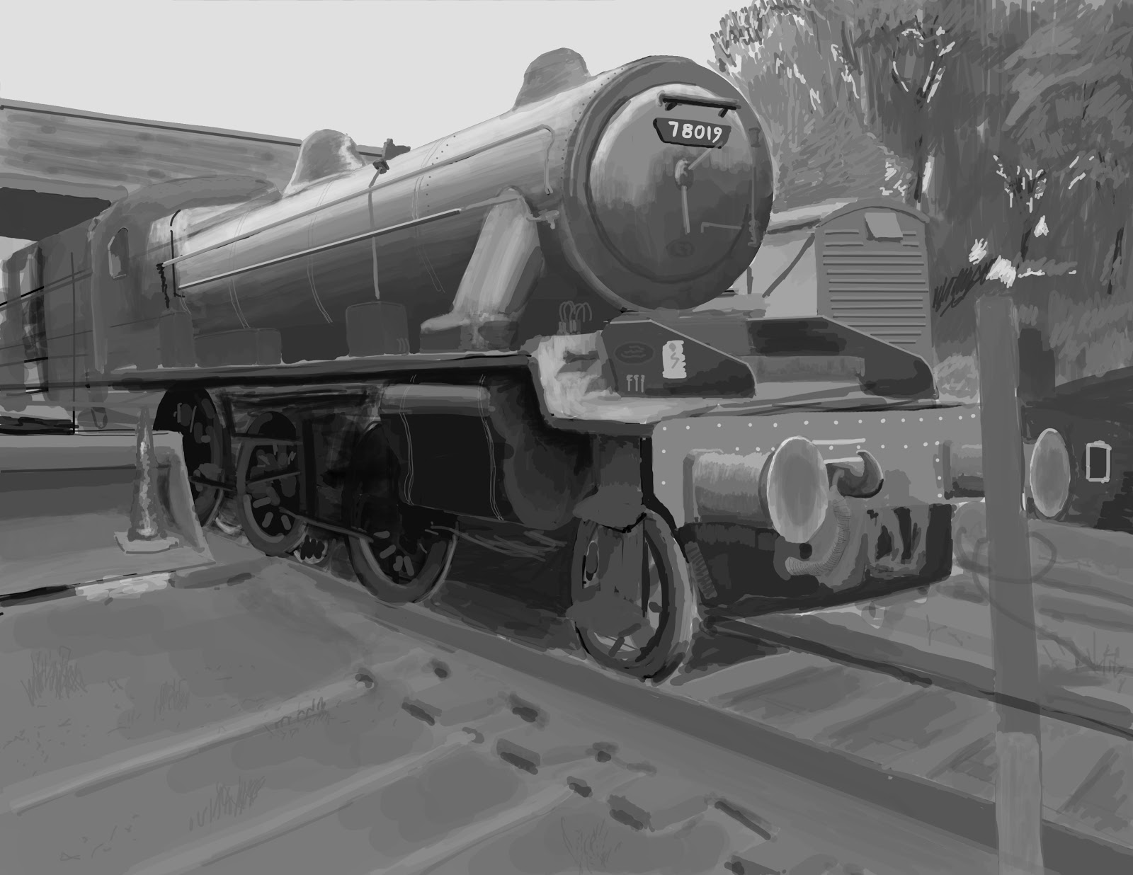

For my final I started off in greyscale as I was rather unconfident with jumping straight into colour. I was still very unfamiliar with Photoshop and felt that I needed to start off a little slow.
However it was actually taking much longer than I had thought and ended up half way through diving into colouring. Working in colour was actually not as hard as I thought it out to be. I really enjoyed working in colour and definitely brought more life to when it was greyscale. I was quite pleased with the outcome but feel that I now really have to work out my values within my paintings. This project was great for boosting my confidence with digipainting.


Trip to Abbey Park


The day to Abbey Park was actually quite a pleasant one, the weather wasn’t that bad (to me) and I had a good time catching up with a lot of my friends about their holidays as we walked along the canal (dodging bikers on the way!)

As we got there, we walked with the lecture until we were in front of the mini café. I was hit with a barrage of memories, of when I first came here with my (then new) friends. They were in their first year and I was still in Portsmouth working and saving up to live in Leicester and take up the foundation art course there. I couldn’t help but feel emotions coming up. It’s been about 2 years or something since then.

I focused drawing some landscapes with the lake winning me over for the first thumbnail. I really liked how the grass in the front can potentially set up the foreground, setting up planes. I went on to doing another from the same side of the river bank before deciding to practice on some one and two point perspectives as I could still do with some practice on everything.
 
We decided to take break inside the little café. As I walked in another wave of memories flushed inside of my head of when I sat in here 2 years ago with everyone that’s gone. One particular memory came into my mind when one of my friends was small enough to sit inside the kids ride and took a photo. Definitely fun times!
Anyways, after the break, Joe and I decided to take a walk on the other side of the riverbank and check out the sights and explore a little. I drew a few more thumbs and decided to choose the other side of the river as a potential final.
 
Joe had told me he had a secret place that he had in mind for a final and jokingly said he show me if I didn’t steal his spot. I lol’d cos it sounded a little weird but agreed (good ol' Joe, still got you around buddy!). I was starting to get sick of foliage again by the end of this project but it was worth doing as I need to practice rendering them. The weather started getting bad as little dashes of water drops occasionally brushed my face and by the time me and Joe were leaving the park, it was heavily raining.
 The whole day would have me thinking back on good times I had with my friends and I’ll never forget them. I had a great day with everyone today and got some drawings that I was rather pleased with. Looking back at the first year I feel that my thumbs are looking a little more convincing.

Elements of Game Design Part 6: Visual Composition

Composition can be related to many arts and subjects such as photography, films, music and performances, but for this blog, I will talking about the visual arts of a painter within this post.
A painting without a good composition can often give the wrong feel or mood to the viewer. Without composition, the painting could become quite chaotic and disorderly, or perhaps to mundane, leaving the painting feeling empty. When considering what makes an interesting and good composition, there are a few general points to take note of:

Line
Colour
Shape
Value
Form
Texture
Space

With Line, this doesn’t literally mean a line surrounding an object, bringing it into focus just like in a line drawing but rather it can be many things. It could be other forms in the painting that can create a line within the composition; for example, it could be the curve of the mountains or line of people that can draw the viewer’s gaze towards the main focus of the image or to perhaps divert the eyes back to it when the eyes wander off to other places of the painting.
Nicely focused on that vase and the pattern on it!
Without the ‘lines’ an image can tend to become quite chaotic and disorderly which could lead to the viewer not quite getting the feel that the painter would have wanted.

Colour can also achieve line effects to draw the eye towards the main subject matter, etc. through the use of colour clashes and other various techniques. The use of complimentary colours can be much more pleasing for the eyes to look at, adding onto the composition of the painting. Colours can affect the painting in many other ways, such as the mood, temperature and how friendly/uncanny the subject matter can be.

Shapes can be that of an organic creature or geometric. To visual artists, there is an ‘alphabet’ to string together to create objects with meaning. These are our primitive shapes. Understanding the primitives can lead to us creating and object and understand how the object exists, such as the space it takes up and perhaps why it takes the shape it does.

The gates guiding our eyes to the distance.
Naturally following onto form, without form it can tend to leave the viewer hanging without any sense of depth within the object and even the painting. The form, just like every other element, can bring life to the painting and can lead onto many other techniques within  the image for example, casting shadows and bringing in the contrast to define and associate ourselves with certain objects for example.

Moving onto the values of the painting, it can give the painting a sense of depth within the painting, creating that space within. With correct use of value can show how dark an object is or how far away something is for example, the background tends to fade into a lighter hue in a landscape painting because the light slightly dissipates and desaturates the colours whereas something closer to the foreground the colours would be much stronger or darker.

Texture can utilised to create many natural illusions to the eye. For example the brush stroke used on certain canvases can change the feel and flow of a painting; some could be used to make foliage look more convincing or perhaps rusted metal. Adding the grit and ‘teeth’ can help bring life to the painting with that natural detail added in by the texture.

Spacing the composition is important so that the painting doesn’t get cluttered or becomes lacking with bad spacing choices. An example can be with still life or life drawing. Filling in the negative space sensibly can help frame your subject giving your eye an easier time to look at the image as it in a way puts your eyes on autopilot, directing your eyes comfortably.

The rule of thirds is also a technique that can help direct and capture the composition, maximising the impact of the subject within the composition. The rule of Thirds is where you divide your page into thirds (horizontally and vertically) and then set up the focus within the intersected lines. Though this sort of technique a little harder to balance on landscape paintings.

Not to say all of these elements have a single purpose, as they can all in their own right set moods and atmosphere, etc. within the composition and depends on the actual painting itself. But all of the elements complement each other and come together to achieve the outcome of the composition. They all (usually) coexist with each other, helping to create the bigger picture within their universe.

I've still got a lot to learn... but I'm getting there!
Here is my own digi painting I did recently. I had tried to create a sense of distance and space and chose a photo study of Bradgate Park. I tried to frame the image with the use of colour and light and tried to bring the focus onto the river. I still have much to learn and practice, but within this piece I was experimenting with the types of default brushes Photoshop had as I haven't really tried them before and wanted to see what kind of texture I could ge from them. I added a slight tint of red to the grass patches to complement the green and softened the colours at the back to further that sense of distance between the viewer and the painting.

http://willkempartschool.com/the-secret-of-good-composition/

Saturday, 24 November 2012

Elements of Game Design Part 5: Planning and concepting


Planning and creating concept designs was a practice that was particularly new to me since last year and definitely took some time to get used to. I found when I first started doing concepts last year was that I had a rather hard time kicking off the project. I used to start off my designs with just one vague idea and building upon it. However designs always end up being extremely weak by the time I ‘finish’ them.

Although I am relatively still weak to concepting ideas and planning my projects, I have looked more in depth in ways of how others go about concepting. One very useful advice that I hear and read up is to build up your own visual library. Reading books and travelling for example can be a good way to broaden your imagination. Drawing inspiration from other video games and films aren’t always the best way to concept your ideas from as from my own experience, find it particularly hard to try and make it look unique and not make it feel like a ‘watered down’ version of that design. As I said earlier with reading books, novels generally provide no pictures for you and the world of the book is drawn by your very own imagination. Drawing inspiration from novels can be a good way of getting ideas as they are (usually) bursting full of descriptive words and sentences as well as no previous picture that has been anchored into your head and everything concepted will be all from your very own brain.

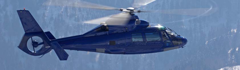
Generic helicopter shape that sticks in my head..
One particular trouble I have when concepting is creating something out of blotting down shapes. It could be because my lack of imagination or too influenced by other’s designs but I can never really see anything out of the shapes I paint on. Another reason I find it hard is because when I design some say like a helicopter, I always have that generic helicopter stuck in my head as I don’t know many other kinds. A friend of mine gave me some very useful tips on how I can make the shapes a little more interesting by cutting up shapes and moving them around, duplicating them and pasting it onto another place on the shape. Definitely researching into your subject is definitely good to broaden your visual library. I had no idea that there were helicopters that looked very insect-like (even made my skin crawl a bit, I hate flying bugs!).

Seeing things like this can help you design believable ideas
Using the internet as a researching resource can be very limiting compared to books on certain subjects and novels because a lot of images in books are copyrighted and are not put on google for example, limiting many in depth research material for your projects.

Another thing that is very important thing that I really need to work on, is to manage my time for planning and concepting. Coming up with very few and weak ideas will almost always leave me with a weak final outcome. Time management and organising your time is very important. Being able to spend time and experiment will create better choices for your outcome as well as plan out your final idea rather than rushing random ideas into it.

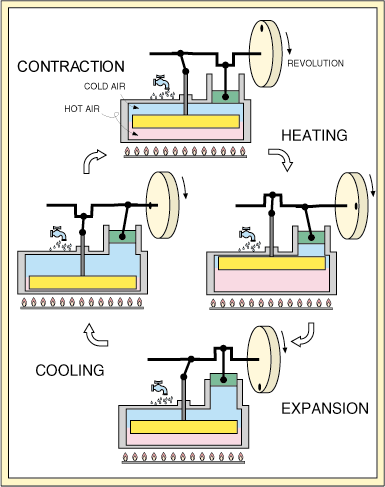
Something that I also take into consideration is how things work. A good way of making an idea look and feel believable is to look at how things work in real life. Designing your ideas around things that work in real life can open up doors to your concepts, eliminating the need of having to explain how it works and increase your visual library.

I’ve recently heard about the concept artist Feng Zhu and have been listening to his tutorials and the way he works in the professional environment. He has definitely been an inspiration to me in the concepting area. I find his tips on digital painting for a beginner (such as myself) very helpful indeed!

http://www.fengzhudesign.com/tutorials.htm

Wednesday, 17 October 2012

Game Art: Round 2!


Hello again!

So begins our second round of university and a refreshing start to the year!

Not being in the year of newbies is a weird feeling. It's a feeling that isn’t bad though; Being able to help the first years learn what I have is a wonderful feeling and is something I want to do as much as I can! During my first year of the course I had many friends that gave me advice and tips on many things (both course related and personal problems) and seeing many of them leave and graduate was both a sad and a happy feeling. I hope to share whatever knowledge I have at the moment and as time goes by, eveything that I'll be learning within the near future.
Made it through first year! ^_^

Throughout the entire first year of university I have learnt many things and proved that I am capable of staying on the course; though I have and always will have much more to learn and to better myself as an artist and as an individual.

There was one thing that had always eaten at me throughout each project, and that was digipainting. With everyone adapting to digipainting throughout the year, it was something that I was never able to get to grips with.
I was a little put off with looking into and practicing it as the lectures were discouraging that kind of work as well as my lack of skill and knowledge, I still always felt that I should start using that medium and not get left behind.
I wasn’t only just put off of it though; I had always been drawn towards digipainting as I am always up for exploring new tools for creating art and seeing all the final pieces of my fellow students only make me want to use it more! I had dabbled a bit towards the end of the first year and during the summer to try and get a feel for the medium but felt that the biggest change was that I wasn’t looking down at what I was painting.
As a beginner to photoshop, I felt very confused how to go about starting and going through to the finish with painting a picture. Not knowing what everything did on the interface was rather mindboggling and the talk of custom brushes confuses me I didn’t know what they meant and many people talk about it and how they download them. I only used the standard brush!
Okay, I'm not THAT n00b..

With the game production side of the course, I am very pleased with the progression I had made throughout last year and hope to improve further.
Though I downloaded other 3D tools such as Zbrush, UDK, etc, I had barely scratched the surface of them as I felt like I didn’t need to learn them at the time.
A part of me wishes that I dug deeper into learning the other 3D tools as I feel a little behind in what I could be producing. I am rather looking forward to the group project (much to the warnings of my graduated friends!) as I’ve always looked forward into group work and that it can be a great opportunity to see how work goes when collaborating, learning a lot from others.

This year is definitely a year to look into colour and digipainting as well as other 3D software. It’s a year to push forward and delve deeper into what I hesitated on giving my attention to. I'm really looking forward to starting life drawing again this year too!

It’s also a year to learn the guitar, my newfound hobby during the summer holidays! Fun times ahead (and very challenging) methinks! ¦3.

Good luck to my wonderful friends that taught me so much and hello to the newcomers of Game Art!